Is it easy to use? Does it convert?
That’s it. Everything else is noise.
Not how it looks. Not what your agency said about your SEO. Not the redesign you did two years ago.
Is it easy to use? Does it convert?
Because here’s the thing – your website doesn’t care how good your brand is. It doesn’t know you’ve got 200 locations and a 30-year track record. It either makes it simple for someone to take the next step, or it doesn’t.
Easy to use
This means a first-time visitor on their phone – and nearly two-thirds of your visitors are on a phone – can figure out what you do, why it matters, and what to do next. In seconds. Not minutes. Seconds.
No hunting for a phone number. No guessing which button to press. No scrolling through paragraphs of text that mean everything to you and nothing to them.
Converts
This means people actually do something. They book. They enquire. They apply for a franchise. They don’t just visit and leave – they act.
If your website gets decent traffic but your enquiry rate is flat, you don’t have a marketing problem. You have a conversion problem. And that’s a commercial problem sitting right under your nose.
How much of a problem?
When I was at Domino’s, we A/B tested the “Order Now” button – changed it from red to green. That’s it. One button, one colour change. It increased conversion by just over 1%. That doesn’t sound like much until you do the maths across millions of website visits. It was worth millions of pounds in additional revenue over the year. One button.
Now think about your website. Not one button – the whole journey. How much revenue is leaking out because the experience isn’t quite right?
Most franchise websites I review fall down in the same places:
- Too much information, not enough direction
- Franchisee recruitment that reads like a legal document
- No urgency, no proof, no reason to act today
- A mobile experience that was clearly an afterthought
And that last point matters more than you think for franchisee recruitment. Research shows that franchise buyers visit your website an average of 16 times and spend around 3 hours on it before they invest. Non-buyers? Just 3 visits and 20 minutes. Your website isn’t a brochure – it’s your longest sales conversation. If it’s not building trust and making the case every single visit, you’re losing candidates you’ll never even know about.
AI changes the game
Here’s what’s changed – AI now makes it possible to do this kind of review at a level that simply wasn’t practical before. Not just checking whether your pages load quickly, but actually analysing your site the way a customer experiences it. Is the messaging clear? Is the journey logical? Are you giving people a reason to act? AI can assess this in minutes across your entire site, consistently and objectively – the kind of review that used to take days and cost thousands.
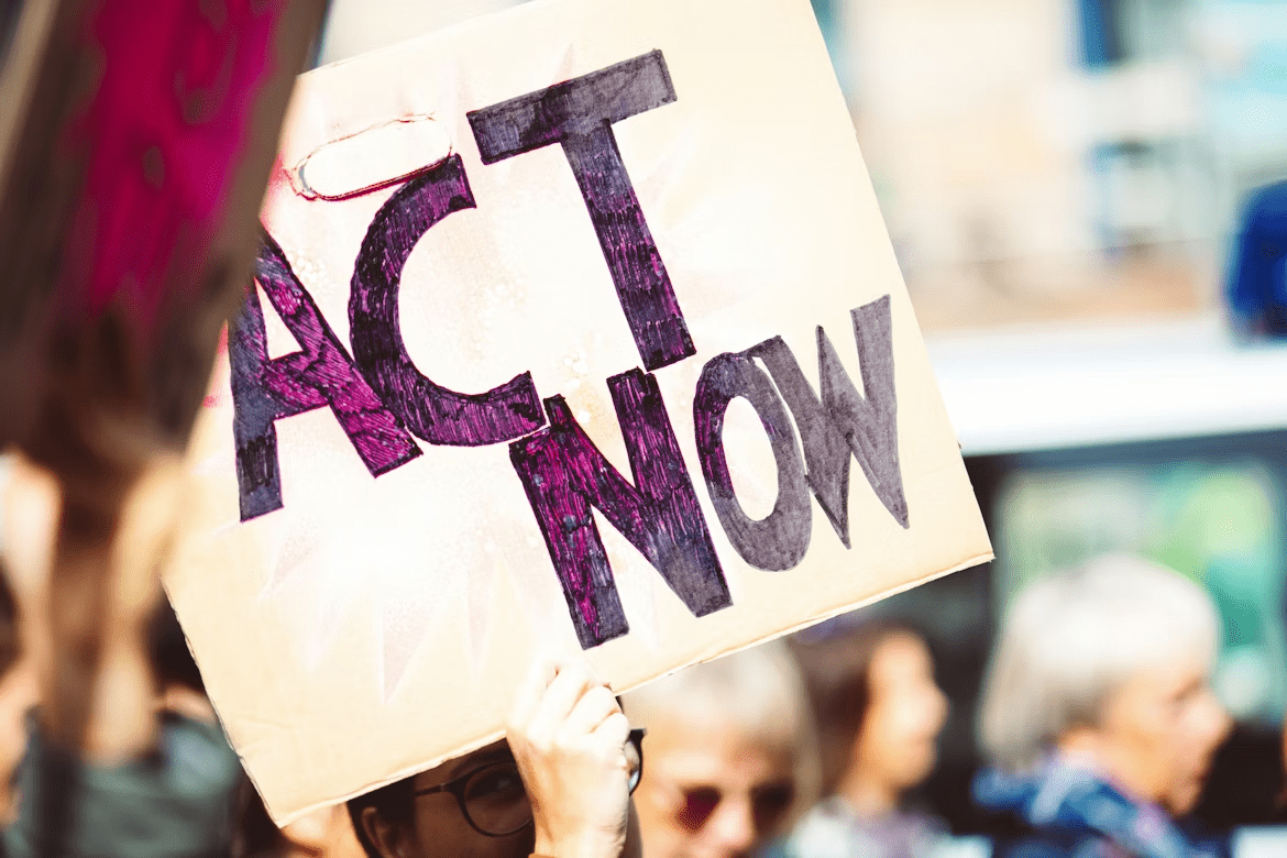
The fix isn’t usually a rebuild. It’s clarity. Strip out what doesn’t earn its place, make the journey obvious, and give people a reason to act.
I’ve built an AI-powered commercial website review that looks at exactly these two things – usability and conversion. Not a technical audit. A straight, honest look at whether your site is working as hard as your business.
I’m offering the first 10 reviews completely free. Drop me a message or get in touch and I’ll send you a no-obligation review within 48 hours.